How to Shoot Hero Pictures for Websites
Hero pictures are responsive. Responsive pictures are automatically re-positioned and re-sized in response to the size of the viewing area on the device (PC, Tablet, and Phone). Because hero pictures are responsive to screen size, these pictures require a large bleed (the border extending beyond the subject).
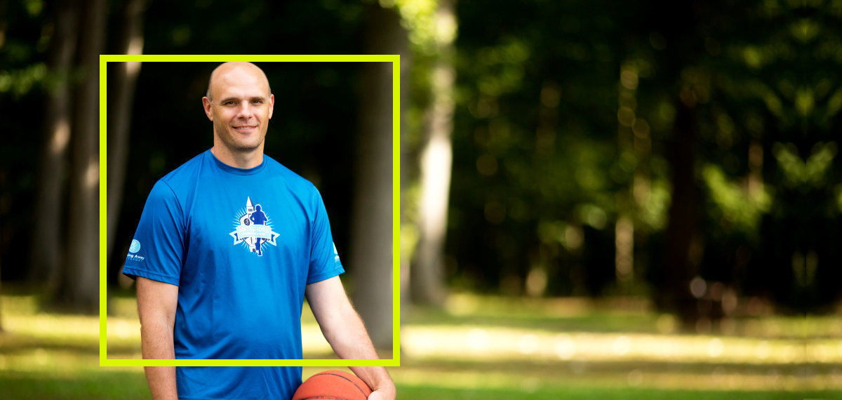
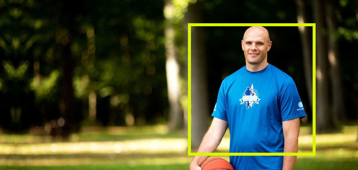
Below are several examples illustrating the main subject of the picture contained in the yellow "subject guide," and the area outside the yellow box is the bleed.
Failure to create a large enough bleed result in the subject area being cut off on certain viewing devices.

Other Variations

